
































Most organisations don’t have a shortage of data.
They have a shortage of useful information.
Zoho One can generate an enormous amount of it. CRM has sales data. Desk has service data. Books has financial data. Recruit has recruitment data. Creator may contain operational data. Other applications contain their own records, reports and dashboards.
Individually, each application can tell you what is happening inside it.
The problem starts when management asks a question that crosses those boundaries.
Are we growing profitably?
Do we have enough operational capacity to meet demand?
Which customers are generating revenue but also creating the highest service workload?
Where are we losing people between application, onboarding and becoming productive?
Those aren’t CRM questions, finance questions or operational questions.
They’re business questions.
And that distinction should determine how you design management reporting.
One of the first things organisations often do when they want better reporting is build more dashboards.
That can actually make the problem worse.
You end up with a sales dashboard, finance dashboard, service dashboard, operations dashboard and perhaps several versions created for different managers.
Each one may be technically correct.
But management is still trying to piece together the overall picture.
The problem isn’t necessarily visualisation.
It’s information architecture.
Before building another dashboard, I would ask:
What decisions are we expecting this dashboard to help somebody make?
If there isn’t a clear answer, you’re probably building reporting rather than management information.
There is a difference.
A common reporting exercise begins like this:
“What data do we have?”
I would start somewhere else.
“What does management need to know?”
Then:
“What decision will they make differently because they know it?”
That changes the conversation.
Take workforce capacity as an example.
You could report:
- total workers;
- active workers;
- available workers;
- hours available;
- hours booked;
- unfilled demand;
- cancellations;
- regional distribution.
All potentially useful.
But simply putting those numbers on a dashboard doesn’t automatically create insight.
A better question might be:
“Where are we likely to be unable to fulfil demand over the next four weeks?”
Now the reporting requirement becomes clearer.
You need demand.
You need supply.
You need location.
You need availability.
You may need worker type or skill.
You need time.
And you need to compare them.
The dashboard is now supporting a decision rather than displaying data.
Good cross-Zoho reporting starts with the same principle as good integration architecture:
Know where the authoritative data lives.
Imagine an organisation uses:
| Business information | System of record |
|---|---|
| Customer | Zoho CRM |
| Sales opportunity | Zoho CRM |
| Invoice and revenue | Zoho Books |
| Support activity | Zoho Desk |
| Operational delivery | Zoho Creator |
| Recruitment | Zoho Recruit |
| Cross-platform reporting | Zoho Analytics |
If you don’t establish those boundaries, reporting quickly becomes unreliable.
Revenue may exist in CRM and Books.
Customer status may exist in CRM and Creator.
Employee information may exist in several applications.
Then somebody asks a perfectly reasonable question:
“Which number is correct?”
If the answer is “it depends which report you look at”, you don’t have a dashboard problem.
Zoho CRM is extremely flexible.
That flexibility can tempt organisations into putting everything inside it.
Finance information.
Operational metrics.
Service statistics.
Recruitment information.
External data.
Sometimes that is justified because users genuinely need the information during a CRM process.
But there is an important distinction between:
information required to operate a process
and
information required to analyse the organisation.
If a salesperson needs to know whether a customer has overdue invoices, surfacing that information in CRM can make sense.
If leadership wants to analyse revenue, service demand, operational performance and customer retention across three years, I wouldn’t try to turn CRM into the analytical platform.
That is what Zoho Analytics — or, in larger environments, an enterprise data platform — is there to do.
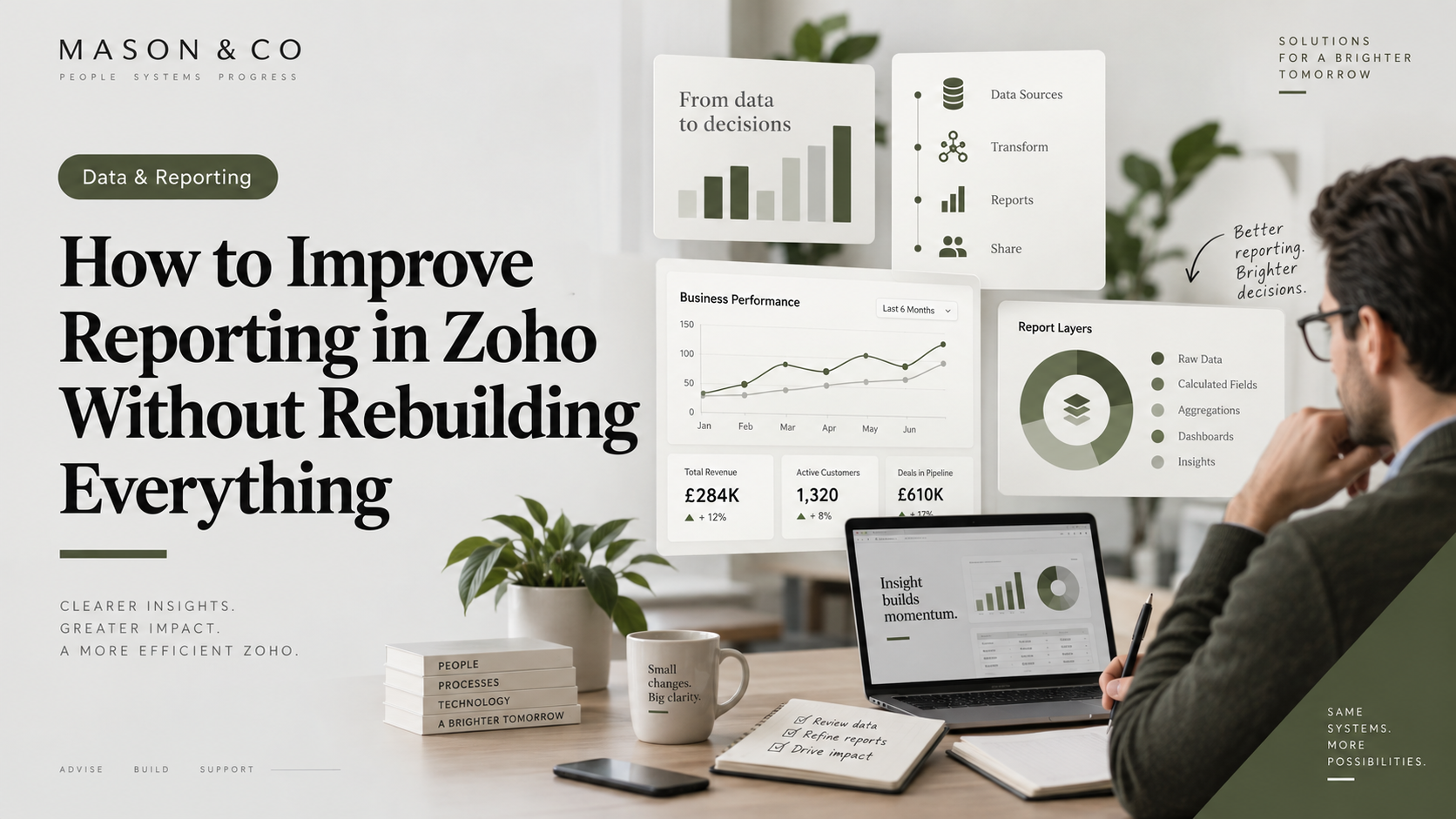
For organisations using several Zoho applications, I generally prefer a reporting architecture that looks something like this:
Operational systems → Reporting/data layer → Management information
CRM continues to run CRM.
Books continues to manage finance.
Desk continues to manage service.
Creator continues to run operational workflows.
Analytics brings the relevant information together.
That separation matters.
It means you don’t have to distort operational applications simply because somebody wants a particular dashboard.
It also means management reporting can evolve without constantly changing the systems employees use to perform their jobs.
This sounds obvious until two departments calculate the same KPI differently.
Take something as simple as an Active Customer.
Does active mean:
A customer with an open opportunity?
A customer who purchased within 12 months?
A customer currently receiving a service?
A customer with an active contract?
A customer whose CRM status says Active?
All of those could be valid.
Only one should drive the KPI.
The same problem appears with terms such as:
- active employee;
- conversion rate;
- cancellation;
- revenue;
- utilisation;
- available capacity;
- customer churn;
- time to hire.
The formula is often the easy part.
Agreeing what the metric actually means is harder.
For every important management KPI, I would document at least:
Definition — What exactly are we measuring?
Source — Which system and fields provide the data?
Calculation — How is the metric derived?
Frequency — How often should it update?
Owner — Who is accountable for its definition?
Context — What does good, bad or unusual look like?
That creates something much more valuable than a collection of charts.
It creates a common business language.
These are often mixed together.
Operational teams need detailed information to manage work today.
For example:
- open tickets;
- outstanding tasks;
- overdue activities;
- unfilled shifts;
- applications awaiting review;
- invoices awaiting action.
Management needs something different.
They need to understand:
- direction;
- performance;
- capacity;
- risk;
- exceptions;
- trends.
An operational dashboard might contain hundreds of records.
A management dashboard may need ten carefully selected metrics.
Neither is inherently better.
They serve different purposes.
Trying to satisfy both audiences with the same dashboard usually produces something that works particularly well for neither.
A KPI without context tells you surprisingly little.
Suppose a dashboard says:
1,240 active customers.
Is that good?
It depends.
Last month there may have been 1,300.
Revenue may have increased.
Service tickets may have doubled.
Customer acquisition may be accelerating while retention is deteriorating.
The number itself doesn’t tell the story.
Management reporting becomes more useful when metrics are connected.
For example:
Demand ↑ 14%
Available capacity ↑ 3%
Unfulfilled demand ↑ 22%
Now there is a relationship.
Something needs attention.
The most useful dashboards often show tension between measures:
Demand versus supply.
Revenue versus cost.
Applications versus hires.
Customers versus service workload.
Sales pipeline versus delivery capacity.
Growth versus retention.
That is where reporting starts becoming management information.
A snapshot tells you where you are.
A trend tells you where you’re going.
If cancellations are 7%, the number may look acceptable.
But if they were:
3% → 4% → 5% → 6% → 7%
you have a different conversation.
The current number isn’t necessarily the problem.
The trajectory is.
For important KPIs, I would generally include:
- current value;
- previous period;
- percentage or absolute movement;
- longer-term trend;
- target or threshold where appropriate.
That allows managers to identify deterioration before it becomes a significant operational issue.
This is one of the biggest differences between an average dashboard and a useful one.
A weak dashboard makes somebody look for problems.
A strong dashboard makes problems difficult to miss.
If five regions are performing normally and one has suddenly developed a capacity issue, that region should become obvious.
If 95% of service cases are within SLA, management probably doesn’t need to inspect all of them.
They need to understand the 5% that aren’t.
Reporting should progressively move from:
What happened?
to:
What changed?
to:
Where should I look?
to:
What action is required?
That’s a much more useful design objective than simply trying to fit more charts onto the screen.
Zoho Analytics can bring together information from multiple systems very effectively.
But integration doesn’t fix the underlying data.
If CRM contains duplicate customers, Analytics will receive duplicate customers.
If statuses are used inconsistently, the dashboard will reflect that inconsistency.
If teams don’t complete mandatory information, reporting will have gaps.
A polished dashboard can actually make poor-quality data more dangerous because it gives unreliable information an appearance of authority.
Before trusting a KPI, understand the data underneath it.
I would check:
- completeness;
- duplication;
- consistency;
- ownership;
- refresh frequency;
- transformation logic;
- exceptions.
The visualisation is the last part of the chain.
“Can we make this real time?” is a common request.
Sometimes the answer should be yes.
Sometimes it should be:
Why?
A live operational command centre may genuinely require near-real-time information.
A monthly executive performance dashboard probably doesn’t.
Real-time reporting can introduce additional integration load, processing complexity and expectations around data freshness without materially improving the decision.
The correct refresh frequency should follow the decision cycle.
If somebody makes the decision once a month, updating the metric every thirty seconds adds very little value.
One of the easiest ways to ruin a good dashboard is to keep adding things.
Someone asks for another KPI.
Another team asks for another chart.
A director wants another filter.
Eventually the dashboard becomes a reporting warehouse in its own right.
I prefer dashboards with a clear purpose.
For example:
Executive Performance
What is happening across the organisation?
Operational Capacity
Can we meet current and future demand?
Customer Performance
Are we acquiring, retaining and serving customers effectively?
Recruitment Funnel
Where are candidates progressing or dropping out?
Each dashboard should answer a coherent set of questions.
If you cannot describe what a dashboard is for in one sentence, it is probably trying to do too much.
Before building a management dashboard, I would work through these seven questions.
1. Who is the audience?
An operations manager and a CEO shouldn’t automatically receive the same information.
2. What decisions are they responsible for?
Reporting should support those decisions.
3. What questions do they need answered?
Translate responsibilities into management questions.
4. Which KPIs answer those questions?
Only include metrics that contribute something useful.
5. Where does the authoritative data live?
Identify the system of record for each measure.
6. What should trigger attention?
Define trends, thresholds and exceptions.
7. What action should follow?
If a metric changes, somebody should understand what they are expected to investigate or do.
If you can’t answer number seven, I would challenge whether the KPI belongs on the dashboard at all.
That is ultimately how I judge management reporting.
Not by how many charts it contains.
Not by how sophisticated the visualisation looks.
Not by how much data has been integrated.
But by whether somebody can look at it and understand:
What is happening?
Why does it matter?
Where should I investigate?
What decision do I need to make?
When those answers require downloading spreadsheets, reconciling reports and asking three departments which number is correct, the organisation doesn’t really have management information.
It has data.
There is a significant difference.
Zoho Analytics is a powerful part of the solution.
But the technology is rarely the hardest part.
The harder work is agreeing ownership, defining KPIs, understanding business questions and deciding what information actually matters.
Do that properly and the dashboard becomes much easier to build.
Skip it and you can spend months creating increasingly sophisticated reports without ever giving management a clearer view of the organisation.
The objective isn’t to put more data in front of people.
It’s to make the right information difficult to ignore.
About Mason & Co
Mason & Co helps organisations design and improve Zoho environments where CRM, operations, finance, automation and reporting need to work as one coherent platform.
We work across Zoho One, CRM, Creator, Analytics, integrations, automation and enterprise architecture, with a focus on making complex environments easier to understand, govern and evolve.
If your management reporting still depends on reconciling information across multiple Zoho applications and spreadsheets, the problem may not be the dashboard. It may be the architecture underneath it.